KITH Web
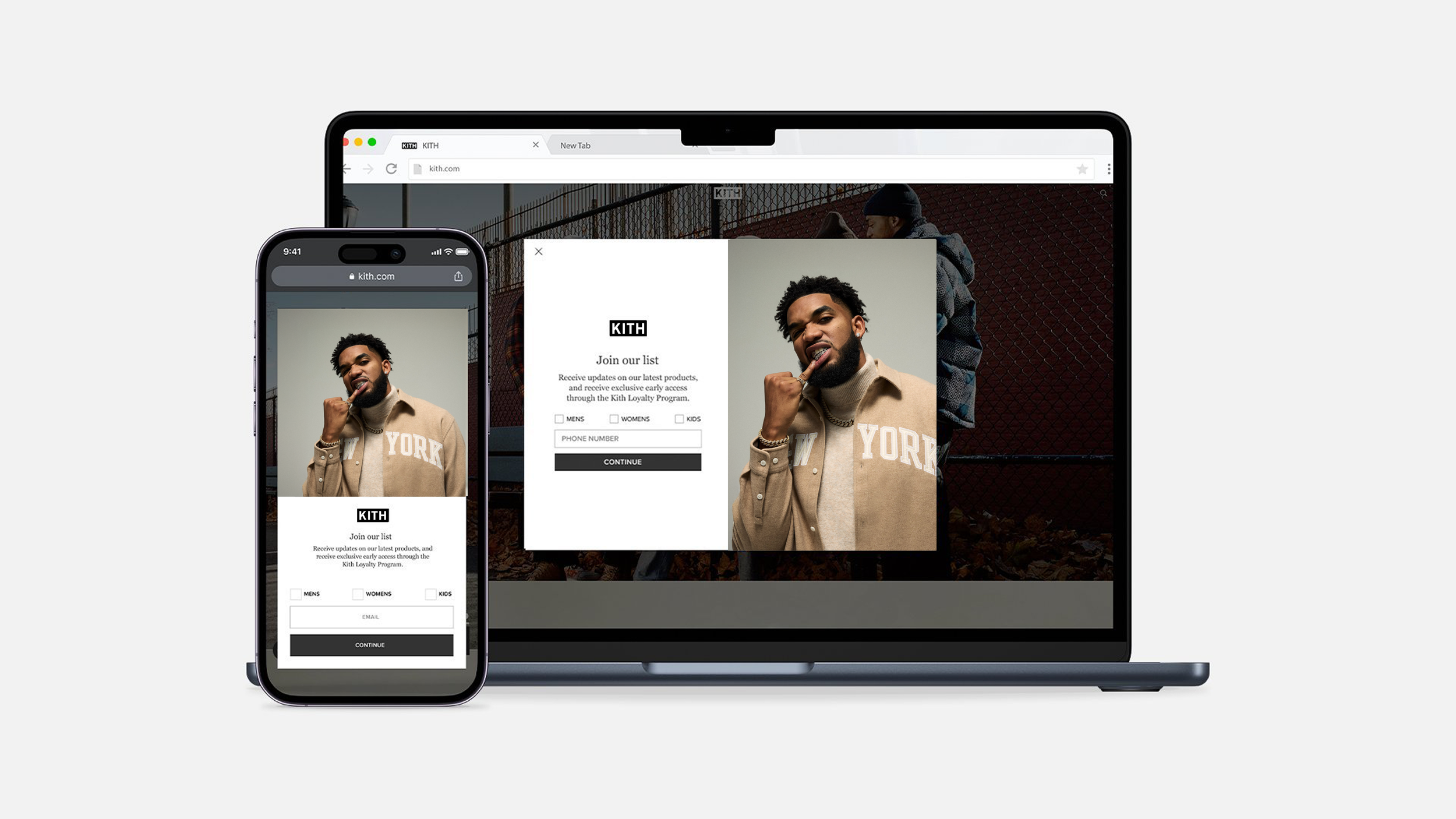
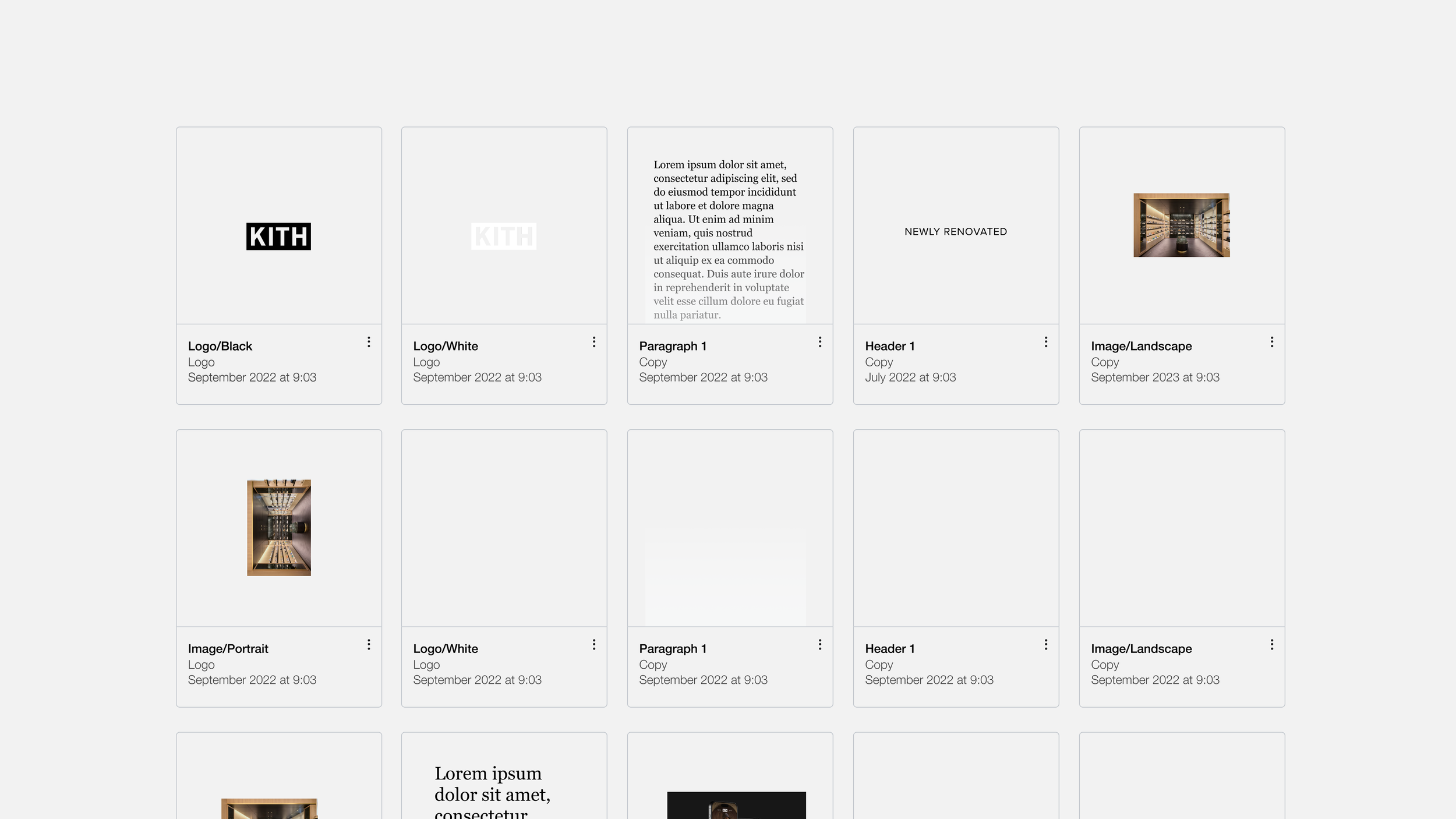
Kith’s digital workflow originally relied on Photoshop, which slowed production and made it harder to maintain consistency across campaigns. I led the transition to a Figma-based web design system, creating reusable components that streamlined design and empowered production teams to move faster. Alongside this shift, I adapted the system to address recurring customer feedback—such as confusion with sizing guides and product navigation—by designing clearer flows and scalable solutions. The result was a flexible design system that not only improved speed-to-market but also elevated the customer experience across Kith’s e-commerce site.
PRODUCT DESIGNER
Website
AI AND TOOLS USED
Adobe Suite
FIGMA
CHATGPT
Midjourney
MAGNIFIC AI
PARTICL
Background
– The website was the ultimate destination for every user journey—the place where sales happened. Because of this, it needed to be as seamless and friction-free as possible. Reducing issues and streamlining the path to purchase were essential to ensure customers could complete transactions quickly and confidently.
CHALLENGE
Customer service teams reported recurring complaints from shoppers, with the size chart standing out as a major pain point. These issues highlighted the need for clearer design solutions and a more seamless shopping experience.
PROJECT DETAILS
ROLE: SENIOR PRODUCT DESIGNER
TEAM: 4 IN HOUSE 1 DEV OUT OF HOUSE
TIMEFRAME: 1 months (NOT INCLUDIng TESTING)
01 GAthering user data for size chart
We received multiple complaints from customers who were unhappy with Kith product sizing—some shirts fit too loosely while others were too tight. To better understand these pain points, we invited customers to share their experiences in exchange for free Kith Treats ice cream. This informal but effective approach gave us direct insights into how shoppers interpreted sizing and what tools could have helped them feel more confident when choosing their fit online.
02 Surveys with customers
We turned frustration into insight. Customer service had flagged repeated complaints—particularly around sizing—so we built surveys to capture those voices directly. By focusing on customers who experienced pain points, we gathered more honest, actionable feedback that helped us identify clear opportunities to improve the shopping experience.
03 Solving the Sizing Challenge
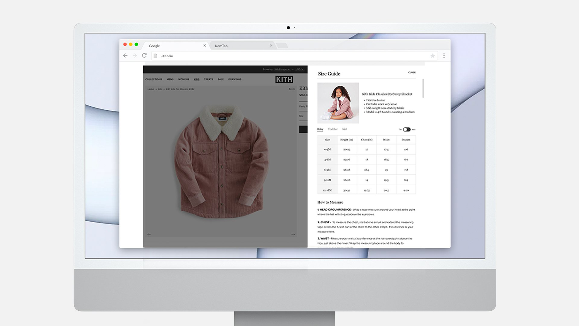
Customer feedback revealed that many shoppers struggled to find their correct size, especially since Kith sizing tends to run larger. To address this, we collaborated with the fashion team, who demonstrated proper body measurement techniques. From their guidance, we designed step-by-step illustrations and clear instructions, creating a user-friendly sizing guide that reduced confusion and helped customers buy with confidence.
USiNG Kith’s Web Design System
Using the Figma design system I built as the foundation, I translated customer feedback into high-fidelity designs that addressed key pain points. Sizing was the most pressing issue—many customers struggled to find the right fit. To solve this, I collaborated with the fashion team, who demonstrated how to properly measure the body. I then turned these insights into detailed, polished design screens featuring step-by-step sizing illustrations and guides. By prototyping at high fidelity, I was able to validate the solution visually, refine the flow, and deliver a sizing experience that felt intuitive, trustworthy, and consistent with Kith’s luxury identity.
RESULTS
Benefits of size chart
Implementing clear, user-friendly sizing tools isn’t just about convenience—it’s strategic. Brands integrating fit recommendation technology and precise size guidance have seen size-related returns drop by 4–10%, and conversions rise by 28%. With bracketing causing 15% of returns alone, better sizing experiences directly reduce customer confusion and stress on support channels."
Evolving Kith’s Design Workflow
Designers using a robust Figma-based design system completed tasks 34% faster than teams working without one. In practical terms, that efficiency gain is like adding 3.5 extra full-time designers every week.
Beyond the Web
The design system I built in Figma didn’t just power Kith’s website—it became a foundation for app flows, Klaviyo email templates, and special projects. By centralizing reusable components, we sped up production, reduced errors, and ensured every digital touchpoint—from drops to campaigns—felt seamless and consistently on-brand.


